How to Optimise your Squarespace Website Design for Mobile

*This blog post is written for Squarespace websites built using the classic editor. Updated post for Fluid Engine editor sites coming soon!*
If you don't have a smartphone, then what are you doing?! Now I'm not saying that not having a smartphone is a bad thing, but the truth is, most people are viewing websites from their phones on the go. Mobile optimisation for your Squarespace website is a top priority now!
But maybe you're wondering if Squarespace is even worth it when it comes to your website on mobile devices. I am here to tell you that your Squarespace website can stand out from everyone else no matter your website visitor's screen size. And don't worry, you don't need to be super tech-savvy and know how to code in order to make your website look totally professional!
Let's talk about the best practices you can implement into your Squarespace website today to stop cringing and start swooning when you look at your website on your phone.
Checking Your Analytics
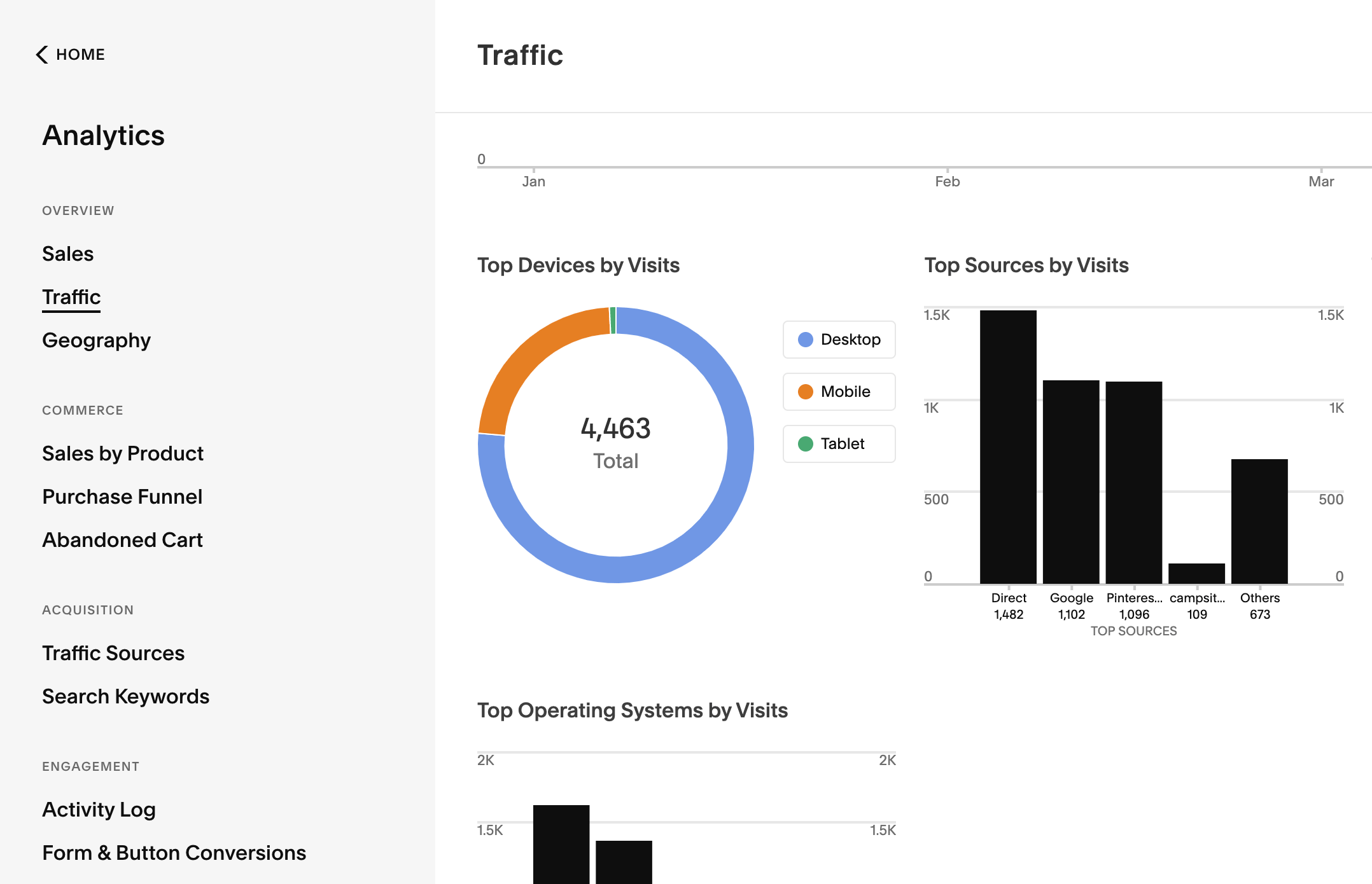
The first thing we want to do is go into the backend of our Squarespace website and check out the analytics to see what kind of devices are most popular with your audience. Follow these steps to find your analytics:
Type in your website URL to your Internet browser and hit escape once the page loads to access the back end of your website
Click on "analytics" in the left-hand menu
Click on "traffic" in the next left-hand menu
Scroll down and check out the "Top Devices by Visits" section. It will look something like this:
Now that you know your analytics, let's talk about best practices that will help your site and its precious content look great everywhere!
Best Squarespace Mobile Optimisation Practices
Over the years as a Squarespace website designer for female entrepreneurs, I’ve gathered my best tips for mobile optimisation that can help you with your own website content. In addition to the tips I’m sharing in this article, check out some of the tips from my friends over at Big Cat Creative in this blog post! The tips that follow work for both Squarespace version - 7.0 and version 7.1!
1 | Use Easy-to-Read Fonts
Fonts on mobile design are much smaller, which with certain fonts, can make them harder to read. Keep fonts clear and legible no matter what font size people are viewing your website at. Translation: go easy on the script fonts! The text content on your website is ultimately what's going to convert website visitors, so let's make sure it's readable.
2 | Background and Text Colour Contrast
On smaller screens, the text takes up more space. This can be a problem when your section background is an image or design with many colours. Make sure that there’s enough of a difference for those who are visually impaired! You can test out your background and text colour combination using this handy tool!
3 | Make Buttons Easy to Read & Click
Button sizes get proportionally smaller on mobile devices, so make sure that the text doesn’t get so small that it’s difficult to read and therefore click. Button clicks are super important, and you can track these in your analytics as well! Take a look at what buttons on your website aren’t converting well and see if you can improve their mobile design to increase conversions. Adding CSS code snippets to your buttons can be super fun and a great way to add personality to your website, but if they aren’t easy to use on mobile devices, then it might be a better idea to find other ways to add in some personality to your website. Luckily, I have an entire blog post about adding personality to your Squarespace website that you can use!
4 | Image focal point
It’s super annoying when you have an amazing header image on your desktop site and then the mobile design completely cuts it off! Argh! There is a way to change this with your image focal point. This can also go hand in hand with my last tip if your image background is making your text hard to read. Click and drag your image focal point (find it under “background” in the page section settings) to the part of the image that you want to draw the most attention to.
5 | Squarespace Block Order
Squarespace automatically stacks your section contents block from left to right on mobile devices. When you have columns on your desktop view, Squarespace will stack the second, third, and following blocks underneath the first one. So instead of adding three images and text below them, use prebuilt Squarespace column layouts with both images and text. Otherwise, you’ll end up with three images and then three text boxes instead of one image then one text box and so on. You can learn more about how blocks stack on mobile devices in this Squarespace help article.
6 | Compress Images to Improve Page Load Speeds
People have short attention spans, especially when they’re on the go and looking at your site on their phone. Make sure that your site loads as fast as possible to keep people on your site! One way to do this is to compress your images for faster page load speeds. I love tinypng.com and tinyjpg.com to do this without compromising image quality!
7 | Regularly Check the Mobile View of Your Squarespace Website
Optimising your Squarespace mobile view isn’t a one time job, it requires continuous maintenance! With this being said, regularly check your website for bugs and little things that might degrade the user experience you’ve worked so hard on! Especially if you’ve added plugins and CSS code snippets, which can negatively impact your mobile website design.
Mobile Optimisation for Squarespace Blog Pages
Optimising your blog post pages take a little bit more work. Enable AMP for your blog post pages. AMP stands for “Accelerated Mobile Pages” and means that your web pages are stripped down of your page to increase load speeds. Enabling AMP means that your pages will prioritize readability, which is perfect for your blog! Squarespace works with Google to recommend AMP websites in mobile search results, so you’re improving your SEO rankings and your mobile website experience when you do this!
However, there is one downside to using this feature. AMP means that your pages won’t show any code blocks or form blocks. To work around this issue, add a button or image with a clickthrough URL that will take people to a form hosted elsewhere (like Flodesk or Dubsado) so they can still take that next step even when you have AMP enabled on your website! Take a look at the image below to see what I mean:

Bonus CSS Code Snippets for Mobile Optimisation
Snag my favourite CSS code snippets that I use both my clients’ websites and my own! Don’t worry, these won’t alter your desktop design either!
Remove hyphens on mobile:
// Remove Hyphens on mobile //
p, h1, h2, h3 { -webkit-hyphens: manual !important; -moz-hyphens: manual !important; -ms-hyphens: manual !important; hyphens: manual !important; }
Centre all text on mobile:
//centre all text on mobile//
@media only screen and (max-width: 640px) h1, h2, h3, p, { text-align: center !important; }
Some people prefer ShowIt over Squarespace because of the ability to edit the mobile design separately, and while that is an amazing feature, it doesn’t mean you can’t have an amazing Squarespace website!
My Standout Squarespace Website Templates (launching soon!) for female online business owners come with simple mobile optimisation practices already implemented so that you don’t have to suffer the headache! Click below to get on the waitlist and be the first to know when these templates launch!
PSSST….THE STANDOUT SQUARESPACE & CANVA TEMPLATES SHOP IS LIVE!
Before you go, I wanted to let you know I’ve launched a template shop selling website, branding & social media templates for new business owners.
Head on over to Creative Market to check out all the products! 👇

Did you like this post? Then pin it to Pinterest! 👇
